Audi’s 2016 Rebrand

The world is still seeing many effects of the technological revolution that started not too long ago. The world’s most popular brands are rushing to adapt to the contemporary ways of doing business, so it makes sense for one of the most prominent players in the automotive industry to do the same.
The German car manufacturer Audi positioned itself as an industry leader who knows how to get to the finish line before others. Their 2016 rebrand is all the proof you need. As if being one of the most prominent car manufacturers in the world wasn’t enough, Audi wanted to add a new title to their name and become a “digital-first” car brand.
The Challenge
By 2020, Audi’s digital transactions are estimated to account for about half of the manufacturer’s entire turnover. While brick-and-mortar dealerships will remain one of the most important sales channels, there will be a significant shift toward the digital realm. Naturally, this calls for a brand revamp.
The idea for the rebrand was simple, yet highly ambitious – redeveloping the Audi brand for 2025 and improving its digital presence and online user experience. It also fell in line with the company’s mission to stay ahead of its time.


Brandsonify offers high performance
Coaching, Branding, Marketing,
Advertising, Technology, and
AI & Big Data solutions for
challenger brands.
The Solution
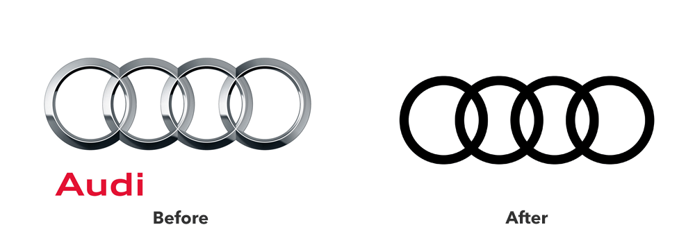
Audi’s legendary four-ring logo was obviously something that had to stay. Of course, this didn’t mean it had to remain the same. After revamping their wordmark in 2009, the company chose to drop it altogether with this campaign. To match the new trend of logomark simplification, Audi decided to adopt a de-polished, flat logo.
But the logo is not the only thing that changed. To ensure a visually-appealing experience across digital devices, Audi introduced a whole new type family. Clean and modern, Audi’s new typography matched the minimalistic approach the brand took with its visual change.

Another significant development was the use of atomic design in Audi’s new web interface. This popular trend in web design is based on a methodology that to build the interface you need to start with its smallest elements. This was exactly what Audi needed. It ensured a seamless interaction between design and technology, making Audi’s interface available on pretty much every digital device out there.
The Results
Audi’s rebranding campaign yielded the exact results the brand hoped for. Everything from their logo to the tiniest icons on the website radiates simplicity and confidence that future-proofs the brand’s visual identity.
It matches definitions of boldness and luxury, which are the main keywords associated with Audi. As brands are still catching up with the popular trends in branding, Audi is already way ahead.
In the words of Simone Labonte, Audi’s brand identity director, “As a matter of principle, we no longer distinguish between digital and analog channels.” The campaign ensured an immersive digital experience that is here to stay.
Brandsonify offers high performance Coaching, Branding,
Marketing, Advertising, Technology, and AI & Big Data
solutions for challenger brands.
Recent Case Studies

Airbnb’s 2014 Rebrand
Founded in 2008, Airbnb is a company which has revolutionized the lodging industry and created a global phenomenon. It is also a majorly disruptive force…
CONTINUE READING
Dunkin’s 2018/19 Rebrand
The first time the world saw the name Dunkin’ Donuts was in 1950. The original shop opened in Quincy, Massachusetts and it did not take long for the public to fall in love…
CONTINUE READING
Uber’s 2018 Rebrand
Uber has made such a massive cultural impact in a relatively short period of time, that it doesn’t need much of an introduction Founded in 2009, it is the default ride-hailing…
CONTINUE READING