Uber’s 2018 Rebrand

Uber has made such a massive cultural impact in a relatively short period of time, that it doesn’t need much of an introduction. Founded in 2009, it is the default ride-hailing service. While Uber has its competitors (Lyft being the biggest one), it will still be the first term that comes to mind for most people when they think of this type of transportation. It’s been so significant for the so-called “sharing economy” that it’s common to see services described as “Uber but for something else.”
Still, while its success is beyond dispute, the company is not without its issues. And in September of 2018, it decided to address many of them with a far-reaching rebrand.
The Problem
Uber was in no real danger of losing its dominant position on the market, but there were still several pressing matters it needed to address. Three stand out:
⦁ Growth
When it appeared, Uber broke new ground with its ride-hailing and ride-sharing concept. But by 2018, this was no longer a novelty so the company needed to keep up with this transition. In addition, it also expanded into food delivery with Uber Eats, and it required something which would represent and promote this growth.
⦁ Criticism
Countless people love Uber, but it is also not without its fair share of critics. Specifically, Uber has developed something of a “take no prisoners” corporate culture over the years. This helped the company soar, but it also tarnished its image. It attracted a lot of negative press,and Uber wanted to rectify this.
2016 Rebrand
Back in 2016, Uber had undergone another rebranding campaign. The 2016 effort wasn’t a disaster, but
it also wasn’t the hit the company had hoped it would be. Not everyone enjoyed the new typography,
and many found the new icon — the “bit”, as Uber called it — to be confusing. Uber acknowledged this
and wanted to set it right.


Brandsonify offers high performance
Coaching, Branding, Marketing,
Advertising, Technology, and
AI & Big Data solutions for
challenger brands.
The Solution
As any good rebrand, Uber’s 2018 campaign was all about understanding what its audience wanted.
According to the company, this meant more than 1000 hours of listening to feedback. After analyzing it,
the company knew what it had to do.
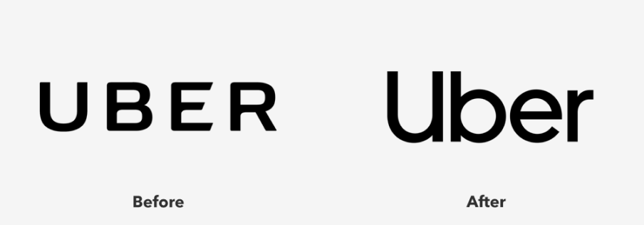
For one, it reasserted itself as a force in the transportation market. It did this by basing its logo,
iconography, typography and other visual elements on roadside and navigation imagery.
It also brought back the beloved “U” and decided to focus on a wordmark rather than a symbol. Uber
has a lot of name recognition, and this is a way to capitalize on it.
A lot of effort also went into dispelling the negative image which had started to surround the brand. You
can see this in the colors. The sharp contrast between black and white makes the text highly legible –
the meaning behind it is that Uber is accessible to everyone. There is also the introduction of safety blue
which is here to calm and reassure users.
Its photography also became much warmer and more inspirational. You can also see this in the tone of
voice. Everything is about putting the audience first and creating a sense of connectedness.

The Result
The result of all this is a rebrand which hit the mark. Some of the throwback features (like the returning
“U”) reminded people of why they got excited about Uber in the first place, while the warmer tone
emphasizes the joy of traveling – it’s an experience, not just getting from point A to point B.
It will take years to see the full effects of this rebrand but for now, Uber remains the premier ride-hailing
company. It services hundreds of cities across the globe, and this rebranding effort looks set to help it
grow even further.
Brandsonify offers high performance Coaching, Branding,
Marketing, Advertising, Technology, and AI & Big Data
solutions for challenger brands.
Recent Case Studies
Airbnb’s 2014 Rebrand
Founded in 2008, Airbnb is a company which has revolutionized the lodging industry and created a global phenomenon. It is also a majorly disruptive force…
CONTINUE READING
Dunkin’s 2018/19 Rebrand
The first time the world saw the name Dunkin’ Donuts was in 1950. The original shop opened in Quincy, Massachusetts and it did not take long for the public to fall in love…
CONTINUE READING
Uber’s 2018 Rebrand
Uber has made such a massive cultural impact in a relatively short period of time, that it doesn’t need much of an introduction Founded in 2009, it is the default ride-hailing…
CONTINUE READING


