Starbucks’ 2011 Rebrand

In the world of coffee, Starbucks is a cult. Its global customer base is incredibly loyal, and millions of people see Starbucks as a part of their lifestyle. If you need proof, scroll through social media. Wherever there’s a #coffee involved, there’s a high chance you’ll see a cup of coffee with a Starbucks’ logo on it.
So why would a brand with such a broad reach need rebranding? Well, the answer is easy – evolution. 2011 marked a new beginning for Starbucks as more than just a coffee company. Their rebranding campaign was simple, yet incredibly effective.
The Challenge
Since 1971, when the first Starbucks took the market by storm, not a lot has changed in terms of the company’s visual identity. And nothing really had to change, though, since everything about the brand has always been a massive success. Positioning itself as a progressive company delivering high-quality products, Starbucks maintained its stellar reputation for decades.
However, a lack of innovation resulted in complacency. Even though Starbucks expanded its product offering, there was room for more change and growth.
Starbucks’ coffee-centricity resulted in the massive following. Brand’s focus on premium quality resonated with consumers, with many of them not even thinking about looking for an alternative. However, this is the same thing that stunned the company’s growth.
The challenge was rather easy – detaching a little from the coffee obsession and opening the door for future branching out. Of course, this couldn’t be done simply by introducing new products, as it would create customer confusion and make Starbucks look like it lost identity. Luckily, there was a simple, yet highly effective solution to making sure this doesn’t happen.


Brandsonify offers high performance
Coaching, Branding, Marketing,
Advertising, Technology, and
AI & Big Data solutions for
challenger brands.
The Solution
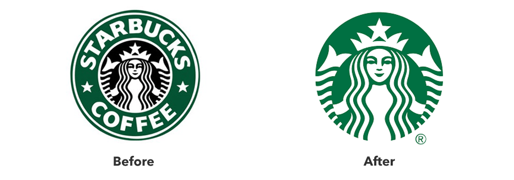
To reimagine its path towards the future, Starbucks began with the logo. All the company did is remove its name and coffee from the logo, but this simple move signified great changes. First of all, by dropping the word “coffee” from its logo, Starbucks showed a clear intention to offer a wider range of products. This was a brilliant move, as it instantly changed the way people saw the chain.
By removing their wordmark from the logo, Starbucks showed it’s confident enough to play to brand’s ubiquity. The world-famous Starbucks Siren has been representing the brand since its first moments, and Starbucks believes that it’s more than recognizable to continue doing it without the brand name above it.
Aside from this, the new logo fell in line with the trend of modern minimalism, ensuring a clean look that future-proofs Starbucks’ visual appeal.
The Results
At first, many Starbucks fans didn’t like this change. But did they accept it? Absolutely.
If you need proof, take a look at the numbers. You’ll see that, since the rebrand, Starbucks’ stock prices almost tripled, marking one of the biggest growth periods in the company’s history. Starbucks fulfilled its goals and started branching out, which is why today it offers various products that keep expanding the chain’s reach and drawing more loyal customers towards the brand.
Brandsonify offers high performance Coaching, Branding,
Marketing, Advertising, Technology, and AI & Big Data
solutions for challenger brands.
Recent Case Studies
Airbnb’s 2014 Rebrand
Founded in 2008, Airbnb is a company which has revolutionized the lodging industry and created a global phenomenon. It is also a majorly disruptive force…
CONTINUE READING
Dunkin’s 2018/19 Rebrand
The first time the world saw the name Dunkin’ Donuts was in 1950. The original shop opened in Quincy, Massachusetts and it did not take long for the public to fall in love…
CONTINUE READING
Uber’s 2018 Rebrand
Uber has made such a massive cultural impact in a relatively short period of time, that it doesn’t need much of an introduction Founded in 2009, it is the default ride-hailing…
CONTINUE READING


