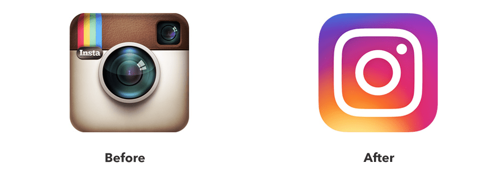
Instagram’s 2016 Rebrand

Instagram launched in October of 2010 and took the social media world by storm. It was mobile-first and focused on visual content, a combination which turned out to be a true recipe for success.
By 2016, the platform had more than 400 million users. At that point, it was clear that Instagram developed into something remarkable. And such incredible growth called for a new look.
The Challenge
The reason behind Instagram’s rebrand was the absolute best case scenario as there was no problem to be solved. Instead, the app developed so much that it grew beyond its current identity.
In the beginning, Instagram was all about a quick and easy way to take photos and then share them with friends. And for this, the retro camera provided the perfect logo. But in the years following its launch, Instagram changed and evolved – its users did not interact with the app in 2016 the same way they did in 2010.
Instagram introduced plenty of new features and services during that time, and video became an incredibly important part of its ecosystem. The platform also turned into a magnet for advertisers and businesses due to its outstanding engagement. Instagram was no longer the place where you would only post filtered photos – it was so much more. Therefore, the brand’s image needed to show this.


Brandsonify offers high performance
Coaching, Branding, Marketing,
Advertising, Technology, and
AI & Big Data solutions for
challenger brands.
The Solution
As is often the case with rebrands, a logo change will attract the most attention – this is exactly what happened here. When Instagram showed off its new design, everyone understood that it represented what the platform became and what it aspired to reach.
The modernized look proudly showed off the app as a leader in its niche. Instagram wasn’t a retro app – it was cutting edge. Now, it had a logo to match.
Instagram did not completely cut ties with its old logo. It was still a camera, only a simpler and minimalistic one. Also, the old design featured a rainbow – the color gradient in the new one paid homage to this.
The look of the app itself also received similar treatment. It became simpler, it put more focus on the content, and it allowed all the features to be integrated in an intuitive way.These updates to the brand’s visual identity reflected the changes to its mission statement. Instagram did not want only to provide photo-sharing but more. Video is a crucial element in storytelling, and Instagram wanted to make the most of it (another proof of this came in 2018 with the launch of IGTV, which provides longer video content.) The app’s old image might have represented a barrier to this, so the rebrand ensured nothing would stand in the way of Instagram’s continued growth.

The Result
Instagram had between 400 and 500 million users at the time of the rebrand. By June 2018, this figure reached one billion. While it would not be realistic to attribute all those new users to the rebrand, the statistics show that the campaign had, beyond any doubt, achieved its goal of setting Instagram on the road to sustained development.
In addition, the platform keeps introducing new features, proving time after time that its old look would have been a constraint. As a service which has grown into a dominant force in today’s society, Instagram needed a brand identity which exemplified this – after the rebrand, it had one.
Brandsonify offers high performance Coaching, Branding,
Marketing, Advertising, Technology, and AI & Big Data
solutions for challenger brands.
Recent Case Studies
Airbnb’s 2014 Rebrand
Founded in 2008, Airbnb is a company which has revolutionized the lodging industry and created a global phenomenon. It is also a majorly disruptive force…
CONTINUE READING
Dunkin’s 2018/19 Rebrand
The first time the world saw the name Dunkin’ Donuts was in 1950. The original shop opened in Quincy, Massachusetts and it did not take long for the public to fall in love…
CONTINUE READING
Uber’s 2018 Rebrand
Uber has made such a massive cultural impact in a relatively short period of time, that it doesn’t need much of an introduction Founded in 2009, it is the default ride-hailing…
CONTINUE READING


