McDonald’s 2016 Rebrand

Americans have a love-hate relationship with McDonald’s. While many people can’t live without it, others don’t want to go anywhere near it.
Whatever your opinion might be, there’s no denying the restaurant’s success. It’s a global phenomenon that doesn’t seem to lose its popularity, and its reach is continuously expanding. However, this doesn’t mean that McDonald’s can relax and forget about their brand.
On the contrary, there have been many rebrands in the past, mainly aiming to improve people’s perception of the chain. The one from 2016 could easily be one of the most successful ones.
The Issue
It doesn’t take a marketing expert to see what’s wrong with McDonald’s – it’s unhealthy. Simple as that. It contributes to obesity as one of America’s biggest pain points, and pretty much everyone knows this. With time, this pressure started catching up to the brand, forcing it to change its ways.
Despite their great success, more and more people started associating it with weight and health issues, so much so that even their legendary color scheme started being a symbol of an unhealthy lifestyle.
Over the years, McDonald’s has done many things to improve its image. From adding different healthy meals to the menu to giving its restaurants a revamp every once in a while, a lot of effort went into positioning McDonald’s as an attractive place to eat at.
And yet, something was still off. Even though McDonald’s reputation did see some improvement, it wasn’t enough to ensure the identity brand was hoping for.
2016 was the year when creative directorship decided to change a seemingly minor thing that would end up yielding great results.


Brandsonify offers high performance
Coaching, Branding, Marketing,
Advertising, Technology, and
AI & Big Data solutions for
challenger brands.
The Solution
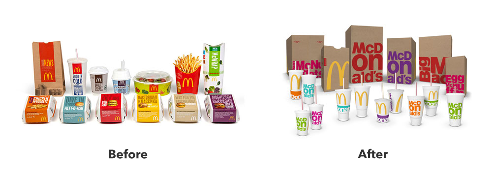
Even though McDonald’s implemented many changes to improve their brand identity, one thing stayed the same – their color scheme. As the restaurant suffered from a staid public image, the main aspect of their visual representation did as well. It was time for a change.
The most important part of the rebranding strategy was expanding the color scheme of its packaging. So how does this fix the fact that many people see the restaurant as unhealthy? Well, it makes much more sense than you might think.
In the food industry, color plays a huge role in marketing. If you go to Whole Foods, you’ll see an abundance of green on brown. These earthy colors signify freshness and health, the cornerstones of Whole Foods’ brand.
It made sense for McDonald’s to add various vibrant colors to their palette, as this would mean reducing the presence of red and yellow, giving a whole new visual identity to the brand.
As a part of the rebrand, McDonald’s partnered with students from Miami International University of Art and Design, who used the new packaging to create fashion accessories. This aimed at highlighting McDonald’s efforts towards making all their packaging from recycled materials.
The Results
McDonald’s achieved great success with this campaign. They showed their environmental consciousness, promoted a vibrant lifestyle, and removed some stains from their image regarding the perception of unhealthiness.
As for the numbers, they’re in alignment with this improvement in reputation. In 2018, McDonald’s saw a 5.5% year-on-year sales increase, as well as the best full-year sales performance. The restaurant’s effort certainly paid off, and it will likely continue to reap the campaign’s benefits in the foreseeable future.
Brandsonify offers high performance Coaching, Branding,
Marketing, Advertising, Technology, and AI & Big Data
solutions for challenger brands.
Recent Case Studies

Airbnb’s 2014 Rebrand
Founded in 2008, Airbnb is a company which has revolutionized the lodging industry and created a global phenomenon. It is also a majorly disruptive force…
CONTINUE READING
Dunkin’s 2018/19 Rebrand
The first time the world saw the name Dunkin’ Donuts was in 1950. The original shop opened in Quincy, Massachusetts and it did not take long for the public to fall in love…
CONTINUE READING
Uber’s 2018 Rebrand
Uber has made such a massive cultural impact in a relatively short period of time, that it doesn’t need much of an introduction Founded in 2009, it is the default ride-hailing…
CONTINUE READING