The Co-op’s 2016 Rebrand

The Co-op (The Co-operative Group) is Britain’s largest consumer co-operative. While it is probably best known for its food shops, the organization’s family of businesses also includes funeral services, insurance services, legal services, and so on.
With a legacy which dates back to 1844, The Co-op has played an important role in the lives of many generations of Britons, but it all nearly came crashing down in the mid-2010s. Specifically, the retailer went through a very rough period in 2013 and 2014 and needed comprehensive restructuring and rebranding to turn its fortunes around.
The Problem
In addition to the previously mentioned businesses, the Co-op — going under the name “The Cooperative” at the time — also had a notable presence in the banking field prior to the rebrand. And this was the center of the group’s problems.
The Co-op’s banking business suffered a loss of £1.5 billion. To make matters worse, the chairman of that division, Paul Flowers, left the organization in disgrace after being involved in a high-profile personal scandal. Rounding everything off, one of the group’s highest-ranking executives quit and called the organization “ungovernable.”
As a result, customers lost faith. This is disastrous for any business but is perhaps even more damning for a cooperative. It became clear that the organization needed to make thorough changes across the board if it hoped to survive.


Brandsonify offers high performance
Coaching, Branding, Marketing,
Advertising, Technology, and
AI & Big Data solutions for
challenger brands.
The Solution
The Co-op needed to alter the public’s perception of it completely. New leadership came on board and restructured the business, cutting ties with the problematic banking division. Then, the organization decided to go through a massive rebrand in 2016. It needed to change both its visual image and its underlying practices. And in both cases, it turned to the past.
For the latter, The Co-op looked back at their original purpose – to help its members and the community. Therefore, it put a new business plan in place which offered greater rewards to their members. In addition, a portion of the proceeds would go toward supporting local causes of the members’ choice.
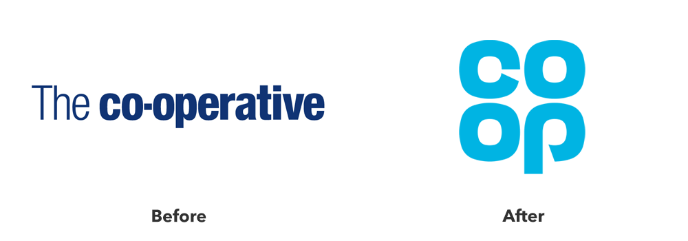
As far as the organization’s image was concerned, the first step in the rebrand was to adopt the shortened Co-op moniker. Then, it introduced a new cloverleaf logo, which was a slightly modernized version of the design from 1968 – this served a dual purpose.
For one, it reminded long-time Co-op customers of happier times, before the organization’s reputation took a massive hit. The group abandoned the 1968 design when it decided to adopt a more corporate image, and bringing it back was a clear signal that the members would once again be the focus.
Secondly, this design prominently features the color blue. As the psychology of color tells us, blue invokes the feelings of compassion and sincerity, something The Co-op desperately needed its customers to feel.
On the whole, the organization adopted a members-first approach, and this was evident in its tone of voice, brick-and-mortar locations, promo materials, and so on.
The Result
It is not an overstatement to say that the rebrand saved The Co-op from ruin. The organization was in the direst of straits, but you could see significant improvements only a year later.
In 2017, The Co-op operated at a profit, and the members felt it – they received £61 million in rewards, while another 13 million went to various community projects. Another clear sign that the rebranding campaign worked was the 15% increase in active membership.
The Co-op’s work is not done. Its problems did not appear overnight, and it will take time to solve them entirely. But, the organization is on the right track. Thanks to a well-planned and well-executed rebrand, the organization’s reputation has recovered and customers, both returning and brand new, trust it.
Brandsonify offers high performance Coaching, Branding,
Marketing, Advertising, Technology, and AI & Big Data
solutions for challenger brands.
Recent Case Studies
Airbnb’s 2014 Rebrand
Founded in 2008, Airbnb is a company which has revolutionized the lodging industry and created a global phenomenon. It is also a majorly disruptive force…
CONTINUE READING
Dunkin’s 2018/19 Rebrand
The first time the world saw the name Dunkin’ Donuts was in 1950. The original shop opened in Quincy, Massachusetts and it did not take long for the public to fall in love…
CONTINUE READING
Uber’s 2018 Rebrand
Uber has made such a massive cultural impact in a relatively short period of time, that it doesn’t need much of an introduction Founded in 2009, it is the default ride-hailing…
CONTINUE READING